Building a t-SNE Plot
A fast and easy way to visualize results from topic modeling
For a recent project I was working on, I did topic modeling on a corpus of around 150,000 documents. Using feature reduction to analyze topics on a dataset of this size can lead to some very interesting results, but it’s quite difficult to share those results to a wider audience without a clear visualization. t-SNE plots are a great way to take multi-dimensional data and present it in a digestible format. t-SNE, or t-distributed stochastic neighbor embedding, is a fairly complicated algorithm, but the most important thing to know in its use as a visualization method is that t-SNE helps preserve relative distances between vectors. This means that vectors with strong Topic A weights will generally appear close to other Topic A vectors, and not as close to Topic B. In addition, if Topic A and Topic B share some similarities, but they are both entirely different than Topic C, then the graphical representation will depict that relationship.
Fortunately, Python has some great tools that make it fairly easy to generate a t-SNE plot, and I’ve written a way to automate the process a fair bit. The only real input required is a vectorized corpus, and its corresponding transformed values through a feature reduction process. For the project that I was working on, I used TFIDF and NMF for a variety of reasons, but that’s for discussion at a later date. Whatever kind of vectorizer or feature reduction algorithm you use, the code below should generate a usable t-SNE plot.
The Code
from sklearn.decomposition import NMF
from sklearn.manifold import TSNE
from sklearn.feature_extraction.text import TfidfVectorizer
import matplotlib
import numpy as np

#Specify your number of topics
n_topics = 15

#Vectorize your word counts
vectorizer = TfidfVectorizer()
docVectors = vectorizer.fit_transform(corpus)

#Do feature reduction on the vectorized output
nmfModel = NMF(n_components=n_topics)
nmfOutput = nmfModel.fit_transform(docVectors)
This block here is importing relevant packages and setting up our vectorizer and feature reduction models. Nothing too fancy here, mostly showing this to elucidate what packages are being used and what my variable names below correspond to.
def create_array_sample(arr,sample_len):
    """NumPy does not have a default random sample function, so I've created one here"""
    origLen = len(arr)
    newArr = np.random.choice(range(origLen), sample_len, replace=False)
    return arr[newArr]

def print_top_words(model, feature_names, n_top_words):
    """Finds the top n words in each topic for a given model"""
    topWords = []
    for topic_idx, topic in enumerate(model.components_):
        currTopic = [feature_names[i] for i in topic.argsort()[:-n_top_words - 1:-1]]
        if n_top_words == 1:
            topWords.append(currTopic[0])
        else:
            topWords.append(currTopic)
    return topWords
These functions are going to be used below. The first one generates a random sample from a NumPy array, the standard format for SKLearn model outputs, and the second gets the top words for each topic of a feature reduction model, given the words from the vectorizer model.
tokens = create_array_sample(nmfOutput,5000) #sample your NMF output
tsneValues = TSNE(metric='cosine').fit_transform(tokens)

#Separate out the output into x,y components
x = tsneValues[:,0]
y = tsneValues[:,1]

#label your topics with most common word in each topic; works just as well if topics is manually created
topics = print_top_words(nmfModel,vectorizer.feature_names(),1)

#Select your color map, nipy_spectral is great for getting differentiated and readable colors
cmap = matplotlib.cm.get_cmap('nipy_spectral')
cmapScale = int(cmap.N / n_topics)

#Rather than manually setting the sizes for everything, use the scale to keep everything in proportion
figScale = 3

plt.figure(figsize=(10*figScale, 10*figScale),facecolor='white')

#For every topic, plot the points where that topic is the max and
#find the topic center by taking the median location of all points associated
#with the topic; draw a text box over it
labels = [np.argmax(tok) for tok in tokens]
for i in range(num_topics):
    boolArr = np.array(labels) == i
    plt.scatter(x[boolArr],y[boolArr],c=cmap(i*cmapScale),s=100)
    x_avg = np.median(x[boolArr])
    y_avg = np.median(y[boolArr])
    plt.annotate(f'#{i+1}: {topics[i][0]}',
                 xy=(x_avg, y_avg),
                 xytext=(5, 2),
                 textcoords='offset points',
                 ha='center',
                 va='center',
                 fontsize=30,
                 bbox=dict(boxstyle="round", fc="whitesmoke",alpha=0.9))
plt.axis('off')
plt.title('t-SNE Plot for Job Descriptions with 15 Topics',fontsize=10*figScale)
plt.show()
And here’s the t-SNE. The comments in the code should explain what’s going on here, but all I’m doing is generating t-SNE transformed values from my NMF output and mapping them to 2-dimensions. Each point is going to have a specific color in the scatter that is created, so you need to iterate through and plot each point individually. For pure automation, I set the topics to be the most common words in each topic, but you can easily replace that portion with whatever you have manually named the topics, or just a topic number. I’ve added in a size scalar to preserve the ratios that I found to be aesthetically pleasing, but that too is fairly easy to update. Finally, I found the ‘nipy_spectral’ color map to be great for showing many topics, but different color maps can also get the job done.
After running the code above, you should end up with something that looks like this:
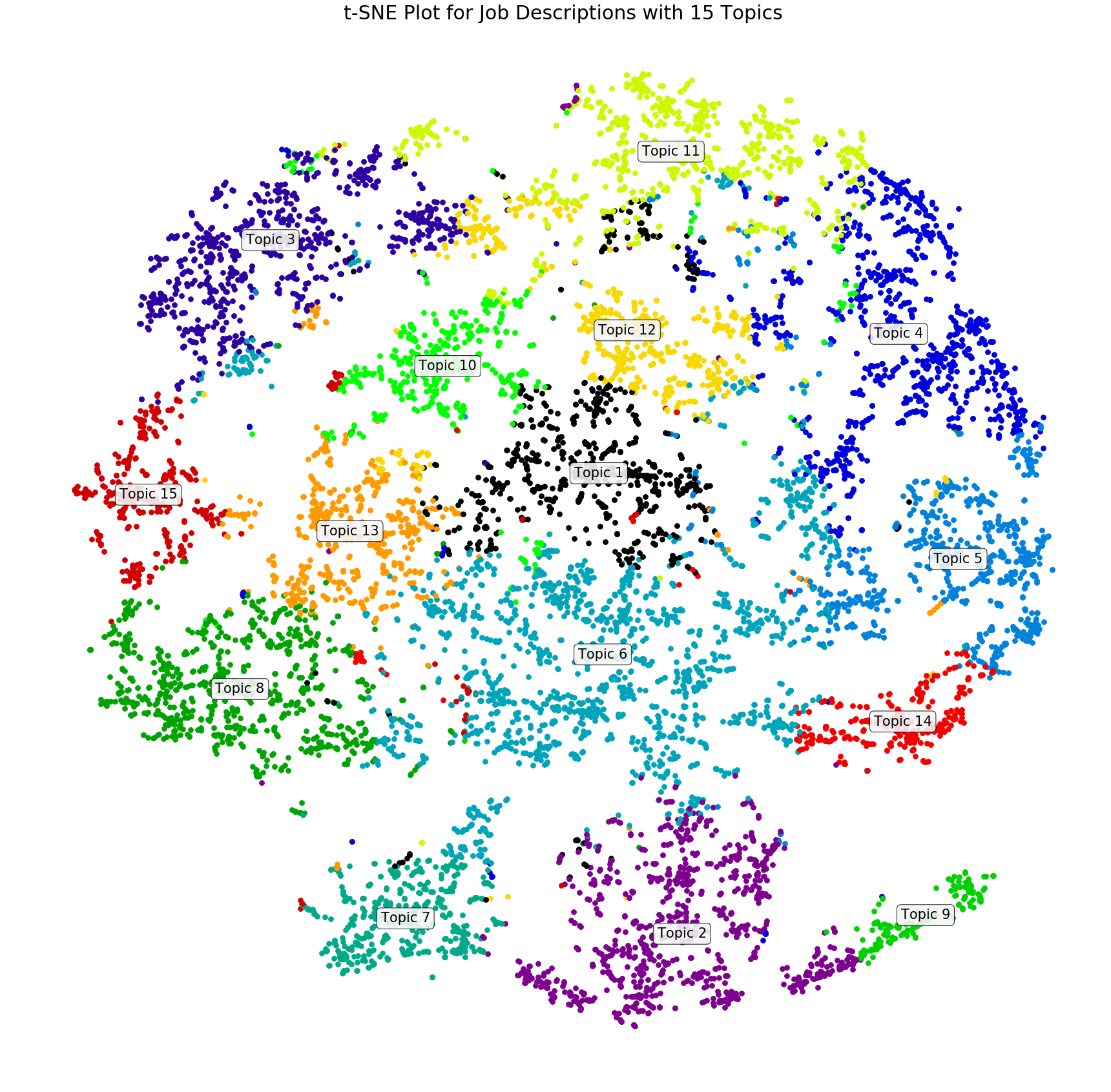
You should be able to see that I have manually named my topics to just be ‘Topic #’, but there are still a ton of insights that can be pulled out of this graph. Topic 1 appears to be pretty central, which means that it is somewhat related to all of the others, while Topic 9 is fairly distant from everything except Topic 2, showing that it is a bit more unique. These types of insights are a great way to validate that your topics make logical sense, and it can also help you develop clearer names for your topics.
I hope this tutorial helped you learn a little bit more about unsupervised learning and analyzing results from topic modeling. t-SNE plots are one of the cooler things that I’ve come across so far in data science because of how interesting these plots can be with real world data, and I hope you feel similarly now too.