MTA Data Analysis
Working with Pandas and Matplotlib
For our first Metis assignment, we were tasked with analyzing MTA data in order to decide the ideal location for a non-profit to collect email address for an upcoming gala. The project was geared towards improving familiarity with the Pandas package in Python, and learning how to effectively clean data.
The Problem
The scenario that was laid out for the class was a data consulting request from a non-profit called WomenYesWomenTech. The organization was putting on a gala to promote their cause, and wanted to find the best locations in the city to position volunteers to collect email addresses from potential attendees. The request was to leverage publicly available MTA (New York City public transportation) data to find the ideal locations in the city.
The Data
The data (which can be pulled from here) is structured into rows of cumulative entries and exits at a turnstile level. Each turnstile is tagged to a specific entrance (Control Area) and station; a given station can have multiple entrances and an entrance can have multiple turnstiles that are being tracked. The data for each turnstile is logged at approximately 4 hour intervals, meaning that the total traffic for a given time interval can be calculated by finding the difference in traffic between that interval and the previous interval.
The Approach
My group decided that the best approach would be to find the ideal locations by exact time of day and day of the week to most efficiently allocate resources. The general hypothesis was that traffic would be highest on weekdays between the hours of 8 AM and 8 PM, as these are the times that people are most actively using public transportation. In addition, it was our opinion that the MTA data could serve as a proxy for generalized foot traffic in an area (i.e. the volunteers would not only be interacting with people coming and going from the subway, but also with others in these high traffic areas). To do this analysis, the data would be grouped into stations (including lines being serviced to account for non-unique names such as “23rd Street”) and grouped into common time intervals to find locations with optimal traffic.
The main issue applying this approach to the data is the inconsistency in the turnstile time intervals. Some turnstiles have intervals that are as long as several weeks, while others have intervals as short has only a few seconds. With these inconsistencies in the intervals, it is incredibly difficult accurately bucket passenger traffic by time of day. My group and I made attempts to spread traffic over the intervals evenly, but the interval issues proved to be too significant to achieve a perfectly accurate spread. Given the time constraints of the project (less than one week start to finish), we decided to make some basic assumptions in order to produce an acceptable Minimum Viable Product (MVP) for the proposal.
In analyzing the data, we saw that the vast majority of time intervals were within a few minutes in either direction of 4 hours. This was especially true after removing extreme intervals of longer than one day. There were few enough problematic entries remaining, that we were able to use the hour when each interval ended to bucket them into the appropriate time slots. The data was still a little off after this, so we took each interval that did not end on one of the common intervals (every 4 hours starting at midnight) that was close to four hours in length, and shifted them to the nearest common interval (e.g. an interval ending at 5PM was shifted to 4PM). After this cleanup process, we were ready to start generating plots to visualize our results.
The Results
Top 10 Stations
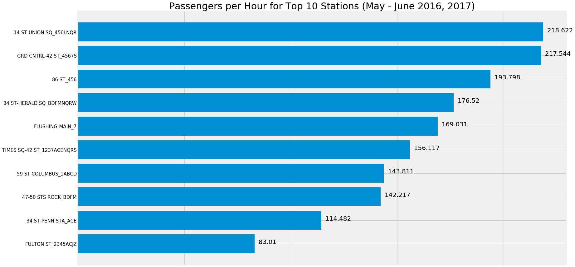
The first piece of our analysis was to find the stations that had the highest rate of traffic in our dataset. To do this, we found the sum of all turnstiles in all entrances for a given station. After that, we took the average per hour for each station in order to smooth over some of the data gaps that were handled in the clean up process (such as removing intervals with unrealistic passenger rates). The stations found to be in the Top 10 were generally unsurprising, all being common commuter stations near offices (like Grand Central) or near residential areas (like 86th Street). The line name was included in each of the station names for uniqueness, as a given station name could apply to multiple different station with distinct entrances. 23rd Street is a great example of this, where 3 different stations between Park Avenue and 6th Avenue are all named 23rd Street but serve different lines. Due to the wide distances between stations such as these, we thought it made the most sense to treat them separately in our data.
Weekday vs. Weekend Passengers
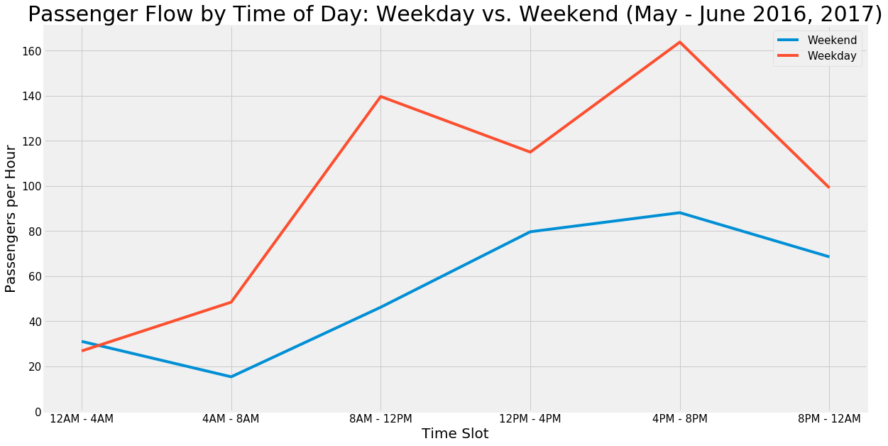
The next component of the analysis was to make a decision on which specific day of the week would be best to position volunteers. The graphs above show that our original hypothesis was correct: traffic is higher on weekdays than weekends. Somewhat surprisingly however, there is not much of a difference within specific weekday or weekend days. Based on these results, we decided that our analysis could be kept to a weekday level, rather than offering opinions at the granularity of specific day of the week.
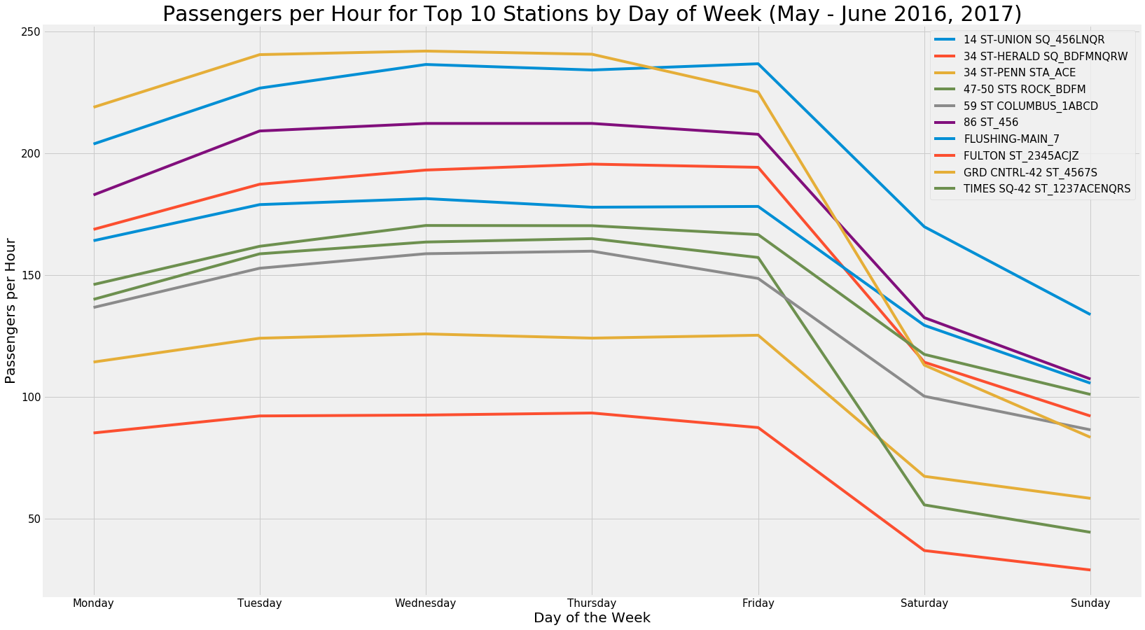
Passenger Flow by Time Slot in Top 10 Stations: Weekday Only
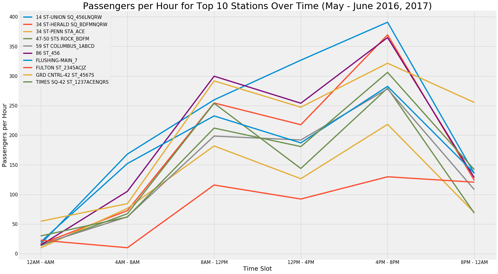
With the analysis centered on weekdays only, we then analyzed the passenger flow for each station by time of day. The plot shown supports the hypothesis that passenger flow is highest during the working day, and in particular during the rush hour blocks of 8AM-12PM and 4PM-8PM.
Passenger Flow by Time Slot for Specific Entrances
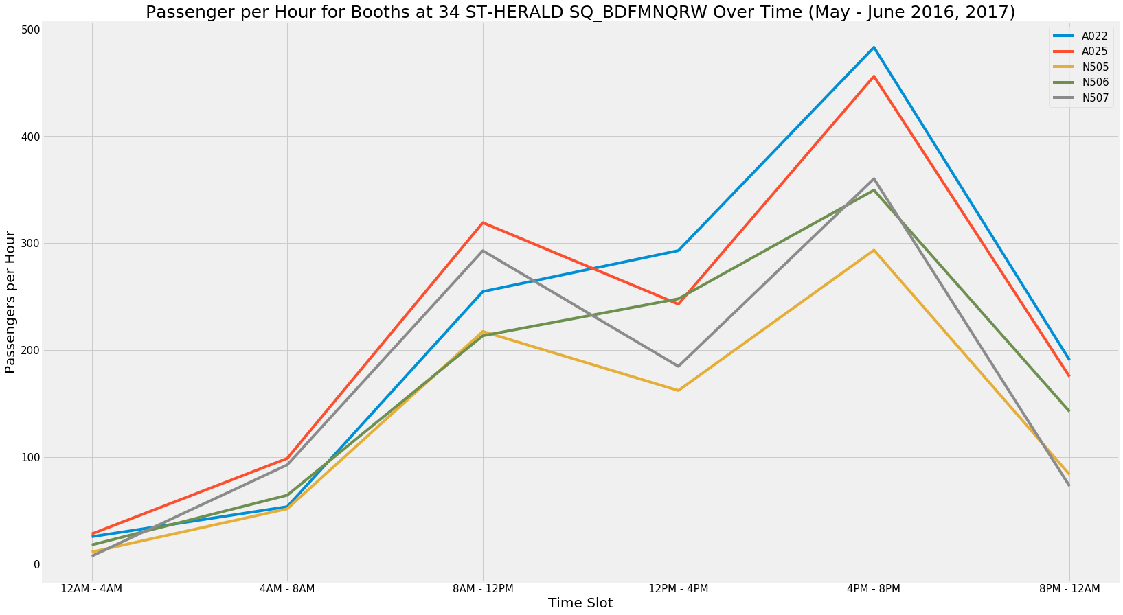
Within each station, we also analyzed whether there were differences in a the flow at specific entrances of each station. We confirmed the presence of a difference by doing a Chi-Squared Test for goodness of fit within each station. The base case for the Chi-Squared was that the average passenger flow at each entrance was equivalent within each time slot (i.e. Entrance A and B would have the same flow from 8AM-12PM and 12PM-4PM, but the 8-12 and 12-4 slots may still be different). This analysis confirmed that within the top 10 stations, there is a statistically significant difference between entrances of a given station. For that reason, we reviewed the plots for each station by booth to make decisions on where volunteers should be positioned within each station. The following table is the final analysis of the data, listing the best entrance for each of the top 10 stations in a given time slot, and the top 3 stations in each time slot highlighted.
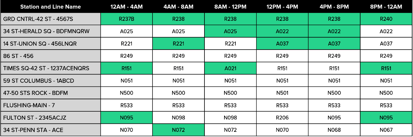
This table could be used by the non-profit to allocate their resources most efficiently. If they have very limited volunteers, they could focus on only the top 3, but otherwise they would still be aware of the most valuable entrances to send their volunteers within each of the top 10 stations.
Takeaways
While the topic itself wasn’t the most compelling thing I’ve ever worked on, the project was a great way to learn some basic principles of data science without layering in too many complex topics. Pandas is an incredibly important package in a data scientist’s toolbox, and this project allowed me to get much more comfortable with manipulating and cleaning data. The same applies for matplotlib, and I used this opportunity to try a variety of things within the package to show the data differently.
Aside from the Python experience that I gained from this project, it was also invaluable to work with a team in a data science setting. It was interesting to see how everyone brought different ideas and skills to the table, and they all coalesced to form a final product. A somewhat frustrating thing about the project was that so many different things that we produced from analyzing the data either didn’t make it into the presentation or were only addressed in a short sentence. The Chi-Squared analysis for example is a fairly statistically intensive analysis, but with the mindset that the presentation was for the members of the non-profit and not other data scientists, the analysis was only mentioned in passing.
MVP was also not a concept that I was very familiar with before the project, but it is essentially the practice of producing a result that is robust enough to satisfy the customer, even if it is not the perfect approach. Coming from consulting, where I’ve spent hours fixing RGB codes on a deck to match shades of blue, thinking this way was a bit of a change. Using this approach is often a necessity in a more complex problem like the one in this project. It becomes a question of spending several hours to pursue a solution that won’t necessarily work, or using a solution that takes significantly less time but is only 90% accurate. Given that it is almost impossible to come up with a 100% correct solution in any problem with so many moving parts, it is often more beneficial to use the more efficient solution.
Overall, this was a great first experience in the realm of data science. I already feel more confident with Python than I did last week, and I can’t wait to see what the rest of the class holds!