NBA Rookie Year Predictions
Using scraped data to create a linear model
The general guidelines of my next Metis project were only to create a linear model using data scraped from the web. I used the BeautifulSoup package to create a model using college stats to predict NBA performance for incoming rookies. The data I used was scraped from Basketball Reference and the college basketball section of Sports Reference. The Sports Reference family of sites are a great resource for any sports fan that’s interested in sports statistics, and they are all fairly easy to scrape. At some point, I hope to build a model to predict fantasy football stats as well, but that’ll have to wait until I have some downtime in the program.
Scraping the Data
As I said, the sites I used are very easy to scrape using the BeautifulSoup package. Compared to Selenium and Scrapy, BeautifulSoup is a much simpler scraping package when you’re dealing with a site that is consistently structured and not too dependent on JavaScript features (such as interactive graphics). To create my model, I used data from the 1996-2017 NBA drafts. I gathered the list of all players taken in these drafts by looping through each NBA draft page on Basketball Reference, storing the player name, link to the player’s page, and draft year in a list. After that, I went through each page that I had gathered, and stored the rookie year stats for any player that had at least one season in the NBA. Each NBA player page also has a link to the player’s college basketball sports reference page, so while gathering the rookie year stats I also traversed the college stats link and gathered the statistics for each player’s final year of college and the link to his team from that year.
In setting up this process, I had to make some early decisions on which players to include in my sample. For ease of analysis, I decided to include only players that had experience in the NCAA, as including European players and players that came straight from high school would add a level of complexity that I wasn’t ready to handle. In addition, I chose to use only a player’s final year of college because all players in my sample would have at least one year, but many players (particularly the top prospects due to the one and done rule) would only have one year of experience. I had originally planned on only using individual statistics for my analysis, but after some initial analysis I decided that including team stats would help to control for players in small roles on very good teams (think of the 38-1 Kentucky team) or large roles on worse teams.
Creating the Model
Once I had gathered all of the data for the players in my set, I began preparing the data for analysis. In some cases, individual statistics were missing from a player’s page, so I made the decision to fill in these blanks with the average for each column. My cost function for the linear regression was Mean Squared Error, so filling in blanks with the average of the sample would have no impact, positive or negative, on the results. The one downside of having these blanks, which I saw in particular on offensive and defensive rebounds in earlier years of my sample, was that the predictive power of these statistics would be lessened because I was effectively removing those players from my sample size for that specific stat. I also decided that I would only analyze players with more than 10 minutes per game in their rookie year, as I only wanted to be analyzing players with a significant sample size to eliminate some of the noise from my data.
In addition to trying to predict basic stats such as FG% and points, I also wanted to include a more “advanced” statistic to better capture the overall value of each player. For this, I chose to use John Hollinger’s gamescore. The main benefit of gamescore is that it is very easy to calculate; it is calculated only using linear weights of basic counting stats. In my final rankings of prospects, I used gamescore as the rating factor in making my “Big Board”. As a sanity check, I reviewed the all-time leaders for rookie gamescore in my sample, and found names like Blake Griffin and Tim Duncan at the top of my list, confirming that it was an acceptable proxy for overall quality. I also decided to only run my models on 1996-2016 so that I could test the results on the 2017 rookie class.
After this initial round of cleaning the data, I began to create my models. I decided that it be most interesting to create models for 12 different key statistics in order to answer more specific questions than who is the best player, such as: “Will DeAndre Ayton be able to block shots as well at the next level?” and “Can Trae Young score as well once he gets to the NBA?” For each of these models, I did a 10-fold cross validation, meaning that for each set of features I was testing, I created and compared 10 different models from 90% of my data and tested the results on the remaining 10% of the data. Cross validation is incredibly important in developing a model in order to reduce the risk of overfitting. An overfit model is one that performs very well on the data being used to train, but not as well when tested on data outside the sample as the coefficients have become too specific. Overfitting can be solved by either removing features or reducing the coefficients for features, and there are a few different ways to diagnose the fit using Sci-Kit Learn.
K Best Features
This method works by taking an argument for K and selecting the K best features for a given model based on a given score (I used the f statistic as my scoring system). For example, if I set K equal to 5, the result would be a model that used the 5 best features for the given output. The f statistic is a number that relates to the probability that a given feature has a statistically significant impact on an output. In order to optimize this method of selection, I ran K Best Features for K equal to 1 through my total number of features (over 60), and found the number K with the best test r2.
Lasso and Ridge Regularization
I’ll group Lasso and Ridge together here as they are mathematically very similar. Respectively, they are taking the usual cost function (MSE in my models) and adding in an L1 and L2 norm term. The L1 norm (Lasso) is also known as the ‘taxicab norm’, which helps to offer insight into the linear distance between two vectors in space if the only way to traverse that space was vertically and horizontally (think of how a taxi needs to navigate Manhattan). The L2 norm (Ridge) is known as the ‘euclidean norm’ and is the distance between two vectors in space if the space can be traversed in any direction. Each of these terms grows larger with the inclusion of more features (think of the space contraints of two dimensions vs. three dimensions) and as coefficients get larger (which would mean a larger overall distance).
With regards to linear regression, they both offer some nice benefits. Lasso is useful because coefficients can be brought to zero, effectively eliminating a feature from a model. Ridge may not be able to eliminate features, but the second dimension to the constraining allows for more granular scaling towards the true value for a coefficient. Both are also useful in that they can help control for colinearity in a model by offering less weight to variables that are too directly related to each other (something that K Best cannot directly address). In finding the ideal r2 for a model using these regularization techniques, these norms are scaled by a value lambda to decide how much the model should be punished for complexity. To find the optimal r2, I ran the two methods of regularization for various values of lambda and selected the model with the lambda that yielded the optimal r2.
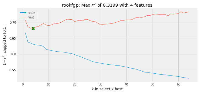
Although I did all this analysis automatically, the real thing that was being looked at with the analysis of the r2 was the learning curve for each result, depicted below. The learning curve shows the spot where the test r2 is at a minimum, and helps confirm accuracy, as the train r2 should consistently trend downward with more features and lower levels of lambda.
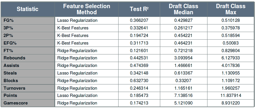
Once I had found the ideal r2 values for each method and each statistic that I was modeling, I then selected the best r2 value across the three methods. Most of the statistics used one of the two regularization methods, with a lower number using the K Best result, suggesting that there is some colinearity in the features being used (as expected given the inclusion of related metrics like shots made and shots taken). The results for each statistic are in the table below.
The gamescore model discussed earlier also offers some interesting insight into the types of college traits that lead to a successful NBA player.
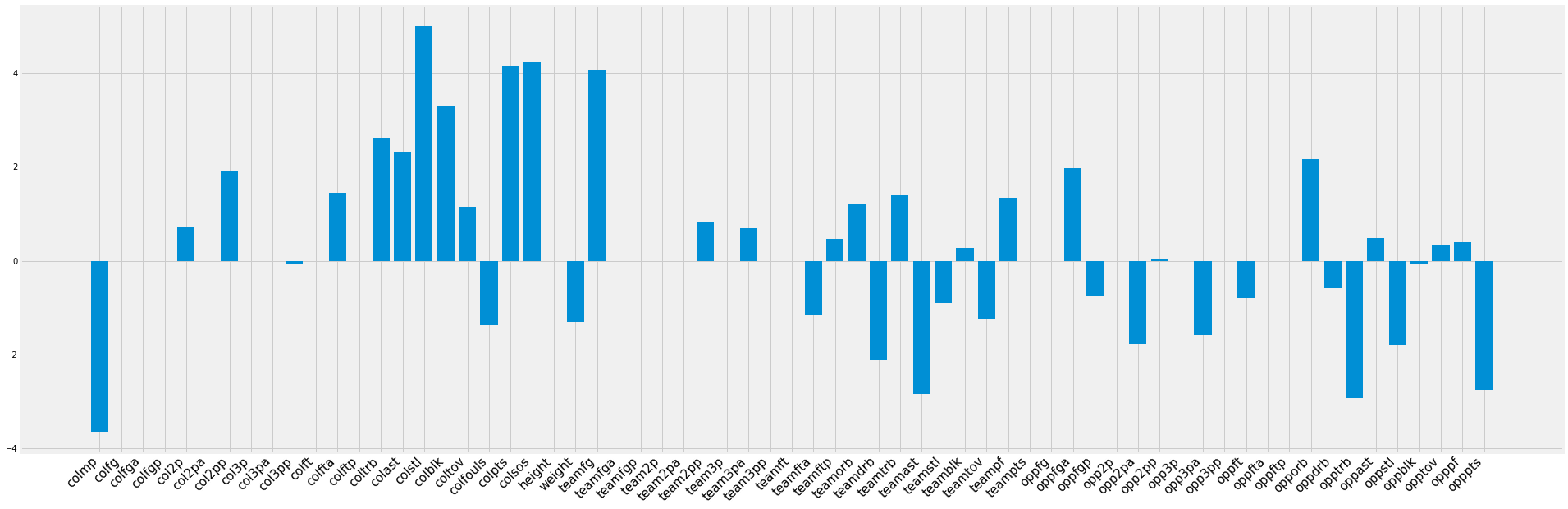
Traditional stats such as points, assists, and rebounds translate well to NBA success, and a player is given credit for playing on a team that does not allow many points (which suggests that he is a better team defender). On the flipside, a player is penalized for playing more minutes, likely because the stats are on a per game basis, and playing on a team with more team assists. This assists point is likely related to the fact that a player on a team with more assists is more likely to be a cog in an offensive machine rather than able to create offense on his own, an important skill in the NBA.
With the models selected, I then analyzed the residuals plot to confirm that the model had worked as expected. The residuals were approximately normally distributed, but the plot of predicted values vs. residuals showed a more concerning trend.
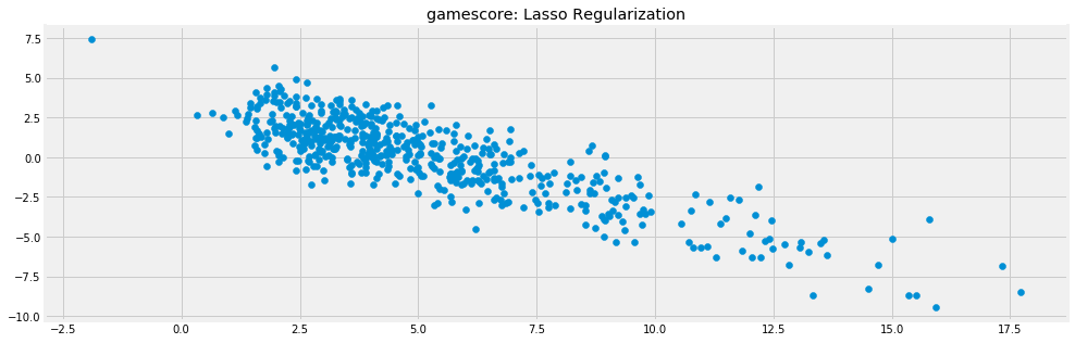
Of note here is the negative linear trend in the residuals, which can be attributed to the hard cap of 0 for gamescore. This means that the prediction can only be wrong by at most that value on the low end (i.e. a prediction of 5 can at worst be off by 5). This in itself if not overly concerning, but most of the models also showed some heteroscedasticity, meaning that predictions got worse on the extreme ends of the model, suggesting less accuracy for outliers. This type of behavior can generally be lessened by transforming the data logarithmically and adding more data to the sample, but for my purposes I decided to accept this issue and say that the model was more accurate in differentiating between middle of the road players. The main reason I chose not to try to improve this issue was because transforming the data could have decreased accuracy for less extreme predictions while not necessarily giving much improvement to those outliers, and I did not have a good way to add more players to the sample.
Testing the Model
After selecting the models for each of the 12 statistics, I analyzed the results on the 2017 rookie class.
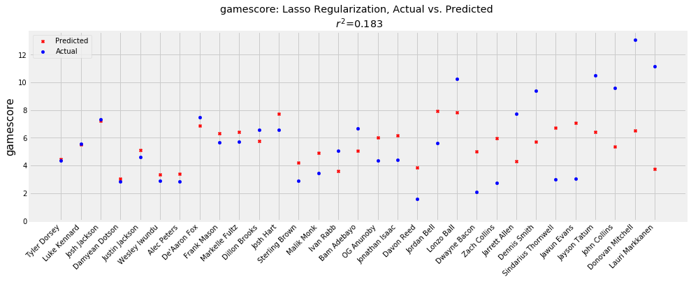
As expected, the model is slightly better on players with more middle of the road projections, while underestimating on high performing players like Donovan Mitchell. Mitchell graded out as a top 10 player in my model, but it did not predict that he would have one of the greatest rookie seasons in recent memory. Lauri Markkanen is another player that my model missed fairly significantly on, as he was graded as a bottom five prospect in the class. Most likely, the model underrated him due to his lack of ability to rebound and block shots in college, two things which he improved upon significantly on entering the NBA. In addition, the model, having been trained using so much data from the late-‘90s and early-‘00s, may have been underrating the value that a floor-stretching big man can provide in the modern era. On the other hand, the model overrated players such as Sindarious Thornwell and Jawun Evans, both of whom had successful college careers that they were less able to translate to the NBA. Important to remember in this analysis is that the r2 for gamescore is around 0.2, suggesting that only 20% of the variation in gamescore can be explained by a player’s performance in college. Overall, I think the real value of my model is in calling out players that the tape may have underrated, such as Jordan Bell. Jordan Bell had a productive if unspectacular career at Oregon, but my model predicted that he would be the second best player in this draft class. He was selected in the early second round in 2017, but his performance this past year suggests that he was likely worth an earlier pick. Using this model could lead a team decision-maker to revisit his or her analysis of Jordan Bell to understand the disparity in the projections and the scouting report.
Projecting 2018
Class Rankings
After analyzing my model, I wanted to go the next step and make some predictions for this incoming class of rookies. I went through a similar web scraping process to what I initially did, but this time I gathered the rosters for every D-I basketball team from last year, and the statistics for every player from those rosters. This led to a dataset of around 5000 players across all skill levels, from walk-ons at small schools with hope only for a 16 seed to top national prospects. I ran each of these players through my models, and used the results to create a draft “Big Board” for the incoming rookies. Of note here is that I did not include consideration for whether or not a player had decided to enter the NBA draft, so some of the players included in my Top 30 may not be entering the draft this year (but maybe they should be)
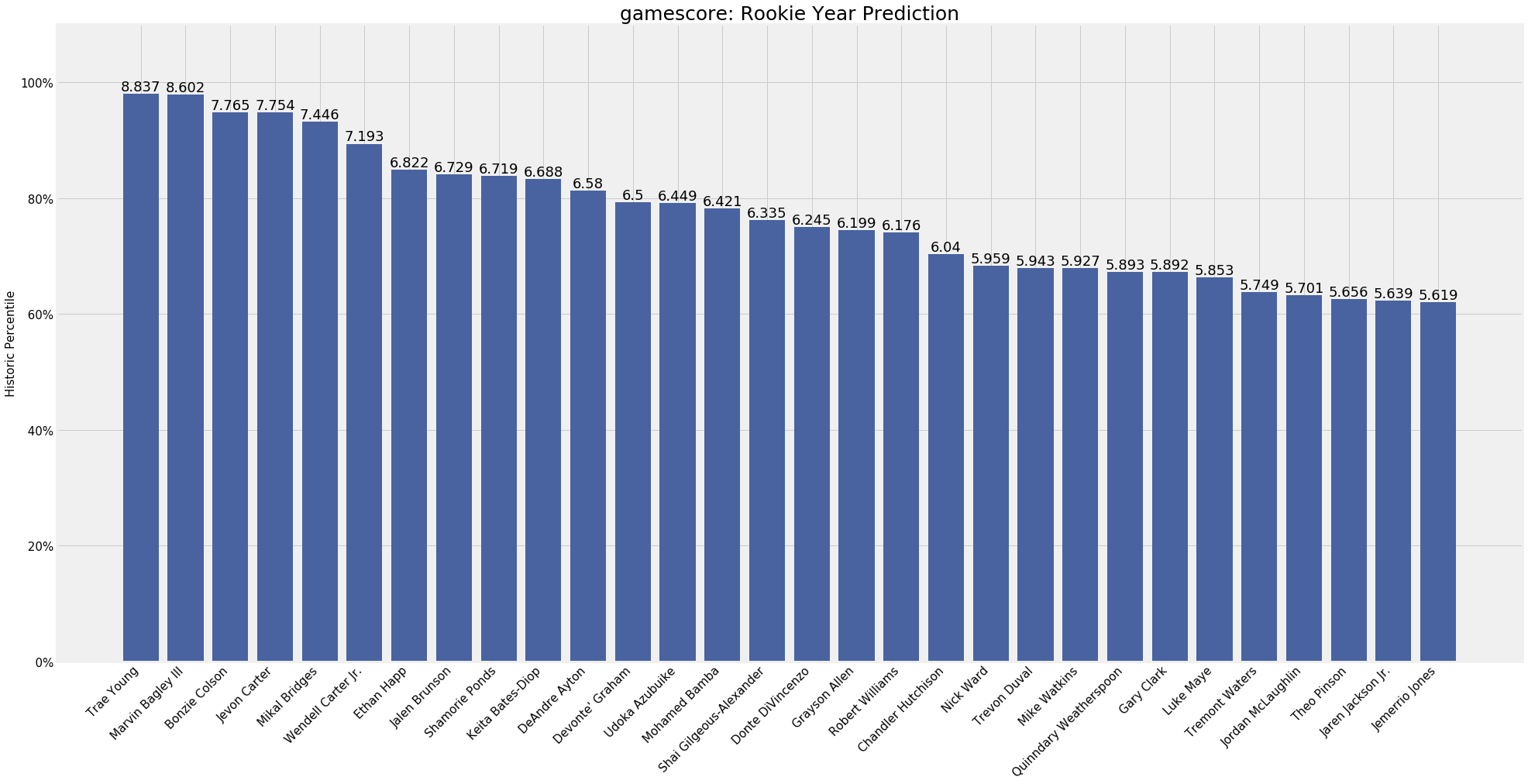
With a Top 5 of Trae Young, Marvin Bagley III, Bonzie Colson, Jevon Carter, and Mikal Bridges, we see the spread of players that my model tends to favor. A couple of those players are consensus lottery picks with very clear talents and others are very productive college players whose NBA futures are a little less clear. As with my 2017 analysis, I think my results help to reaffirm some already held notions about prospects, while also suggesting that scouts may have missed something on others. Jevon Carter for example was an incredibly successful player on WVU teams with stifling defenses, but there are questions about his ability to play outside of Bob Huggins’ system. My model suggests that he should make for a successful NBA rookie, which means that he should be worth a pick in the late first or early second round. Someone like Kevin Knox on the other hand may not be worth the lottery consideration he’s currently getting, as he is nowhere to be found in my Top 30. As I’ve said though, these projections are not meant to be gospel, just one more layer of analysis to be considered when drafting.
Player Projections
In addition to these class level rankings, I also created a few visualizations to better explain some of my individual projections.
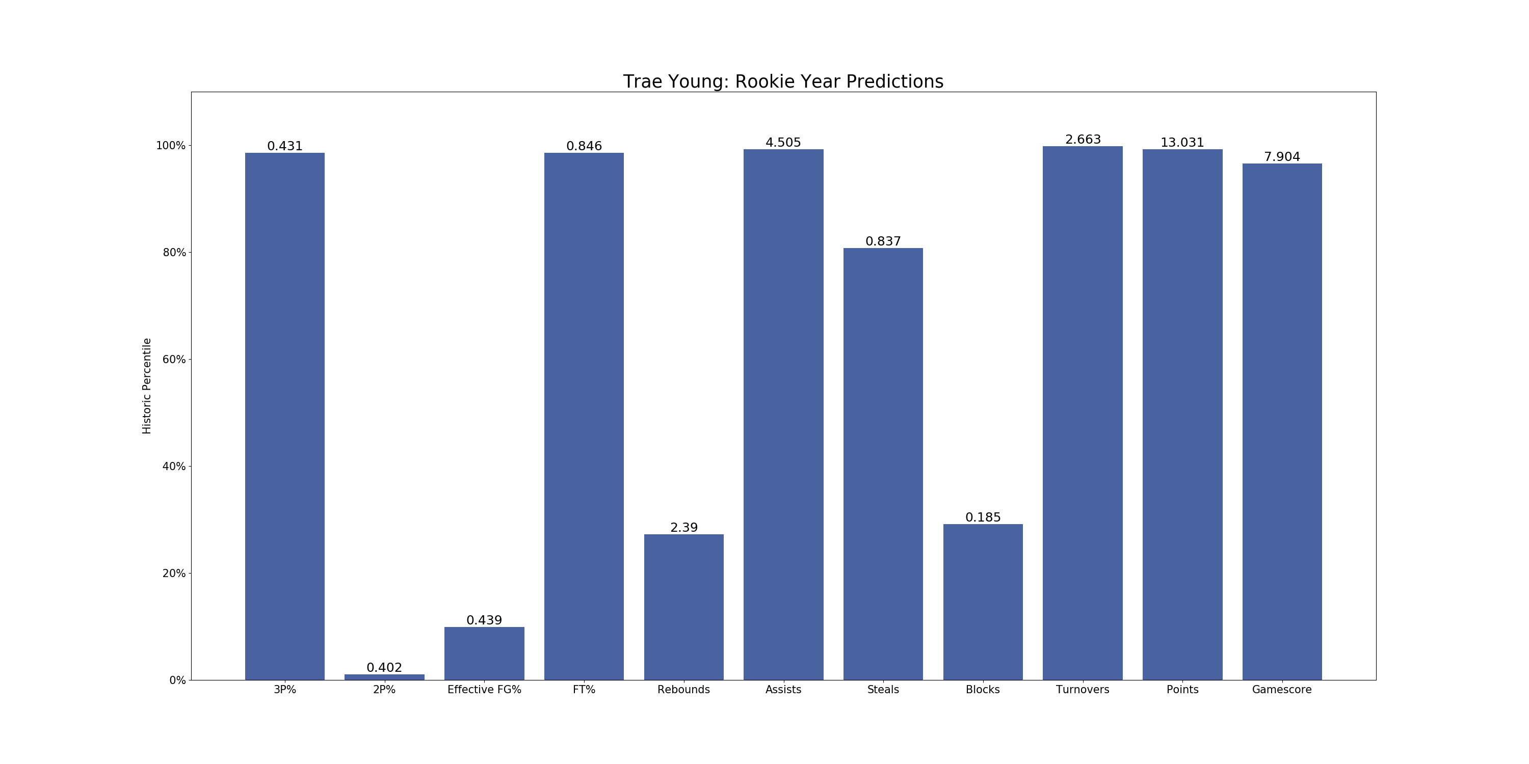
For each prospect in my database, I created a chart like the one above for Trae Young, which shows his historical percentile rankings for each predicted statistic, as well as the actual value for the prediction. For example, I have projected him to have a 3-point percentage of 43.1%, which is historically around the 95th percentile for predictions the model generated on players from my sample. Judging by these predictions, it seems like many of Trae Young’s strengths and weaknesses from college will continue to exist in the NBA. The main question with him still is whether his positives (shooting, playmaking) will outweigh the negatives (size, turnovers), and my model seems to agree, projecting good shooting and assist numbers but also high turnovers and low rebounds and blocks. With a gamescore as high as his projection though, the model seems to believe that the positives will indeed outweigh the negatives.
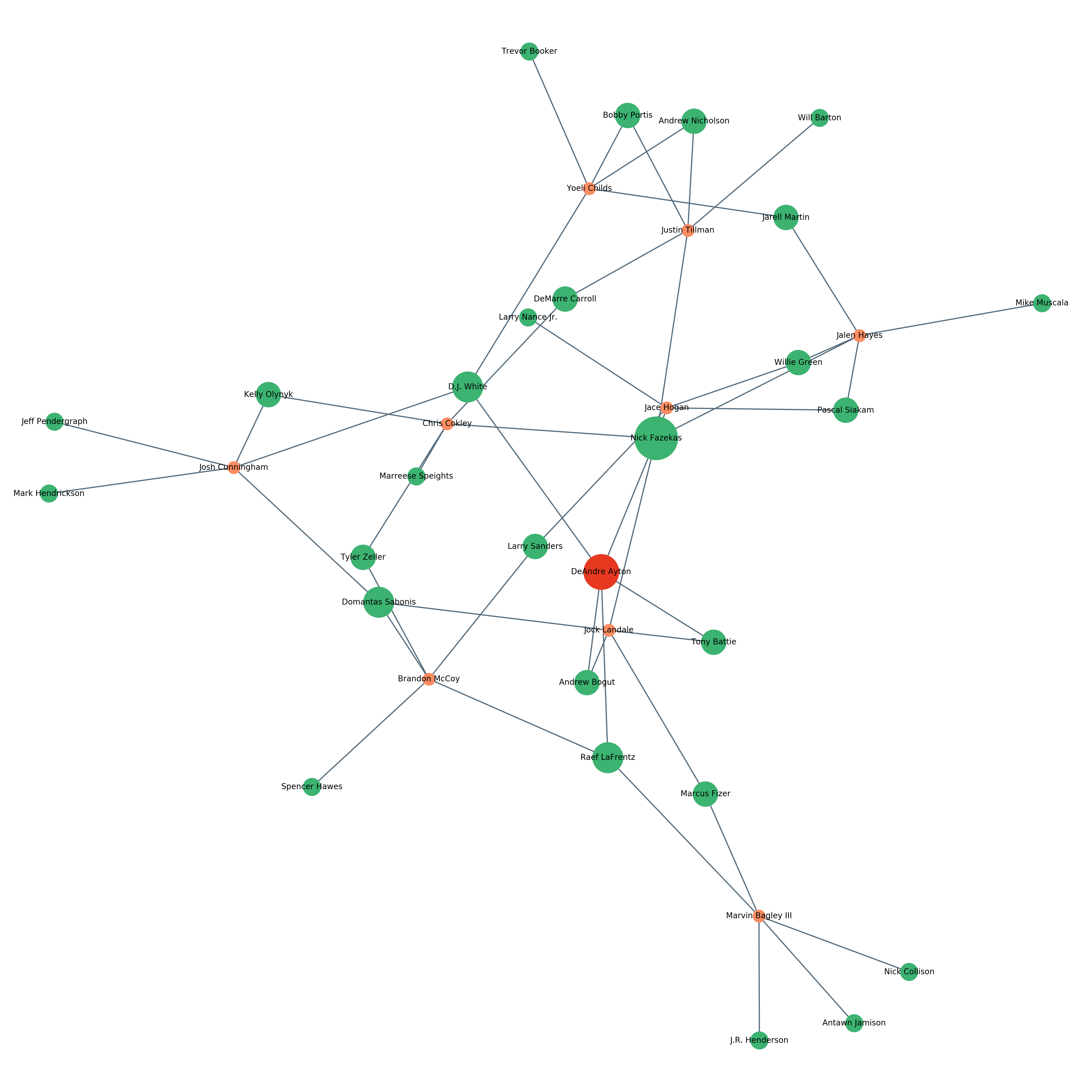
I also created this similarity web for each of the players in my dataset (DeAndre Ayton shown above). To create this graph, I created a similarity score between each player in 2018 and the players from 1996-2017 using the euclidean distance between each player’s college stats and physical traits. As discussed in the Ridge Regularization section, euclidean distance is the distance between the end points of two vectors, essentially the Pythagorean Theorem in 30 dimensions. With each of these similarity scores, I associated each player in 2018 with his five most similar players. The web is then generated by returning each of these five most similar players, all other players from 2018 with overlap on these five, and then the remaining similar players for those 2018 players. For example, DeAndre Ayton is most similar to Tony Battie, Andrew Bogut, DJ White, Nick Fazekas, and Raef LaFrentz. Marvin Bagley III shares Raef LaFrentz, so Marvin Bagley III and his 4 other most similar players are returned. The visualization, made with NetworkX, then distributes the nodes so that natural clusters form around heavily related connections. This means that Marvin Bagley III, who does not overlap much with other players in the sample, ends up towards the outside of the web, and Yoeli Childs and Justin Tillman, who share a few similar players, end up fairly close together. Looking at these webs for players is a very interesting way to see how different prospects relate to each other.
Takeaways
This project was a ton of fun for a variety of reasons. I really enjoyed being able to apply what I’m learning to something else that I love, and it was incredible satisfying to end up with results that somewhat reflect the consensus rankings. If I ever have a chance, I would love to be able to include European players in my sample, and perhaps try to project further into an NBA career beyond the rookie season. Given the time constraints of the project, I’m very pleased with the results that I was able to obtain. I even decided to build a Flask app to easily navigate my predictions, and I’ll plan on writing a quick post about that process when I have some time. This was a great learning experience, and I can’t wait to see how these predictions work for the NBA next year.
UPDATE: I deployed the app using AWS here and you can find my post with a tutorial on building and deploying a Flask app here.